While the temperatures dropped to freezing, we kept ourselves warm with hot apple cider and brainwork. Here’s what we released in December.
Now you can filter your income and expense categories by date for a clearer understanding of ins and outs. We added a new invoicing field for your client’s business name, plus space for extra invoice item details. And our new iPad app shows you a wider picture, on the go.
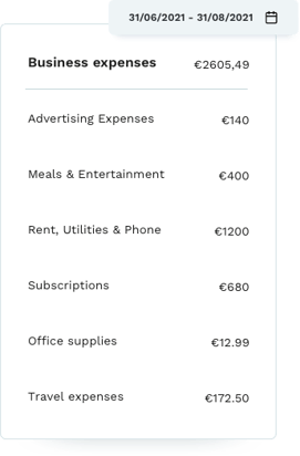
Filter categories by date and view totals – understand ins and outs

Did you use the past few months to level up your sales? Now you can easily view your income from this month, quarter, year, or any other period. Or did you invest in yourself this holiday season?
Our update lets you filter a specific category activity by date. The totals from each category and period are automatically calculated so you can better understand your ins and outs.
To filter categories by date, log in at Holvi.com and go to Bookkeeping → Categories.
New invoice details
To help make 2022 a profitable year, we’re making it easier to collect your earnings. Now you can include your client’s business name and more details about your product or service.
Client’s business name
This is fairly self-explanatory. Now you can include your client’s business name, in addition to their legal name. This was a highly requested field and important for anyone selling B2B.
Invoice item details
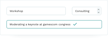
Say you did 10 hours’ consulting work for a client. With our new text field, you can include any extra details about how you spent those 10 hours. This isn’t strictly necessary – it’s just nice to have room to expand on the work you’re charging for, if you want.

How does it work? Create an invoice and add your invoice item. Underneath the standard invoicing settings you’ll find a new text field where you can add item details with formatting.
Holvi iPad app
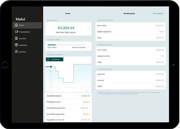
Holvi’s new iPad app shows you a wider picture of your business finances on a mobile device. Now you can browse transactions without tapping back and forth. Just tap a transaction and view its details on the right – all on one screen. Clean, clear and portable. Sometimes it’s just nice to give your numbers a bit of space.
For business on the go, minus the squinting and hand cramps.


/6_how_it_works.png?width=477&name=6_how_it_works.png)